Tuesday, December 15, 2009

Book Cover – Final


Here is my final project. I think that this might be my most successful project thus far. I think that it is really getting across what I wanted & looks finished. I think it captures the overall feel of the book without depicting any specific scene from the book. It especially captures the element of "big brother is watching you" without having to write it out. Nice way to finish the semester.

Final Reflection

Well this has been a pretty interesting learning experience. I was not looking forward to this class initially, but I think that it has really been a great class and I have learned a ton. I can see quite clearly how far my illustration technique has come and am really starting to feel like I have a small handle on what I am doing.

With the last illustration it was the first piece where I felt like I could get down what I had in my head without having to try something and erase it a few times over. I am really starting to enjoy illustrating and hope to do more of it over this break and in the future.

I think that the range of projects I have included in my final portfolio show the wide range of projects/style/techniques that I have been able to accomplish. I ended up going through most of the included projects and refining/changing the bits that where not up to par. I think that the final collection turned out quite good.

Here is a link to my pdf portfolio.

Friday, December 4, 2009

Sound Illustration


This illustration was surprisingly difficult to render in the style that I had in my head. I think that the overall feel of the image is very representational of how Stevie Ray Vaughn sounds. I think that the raw look of this piece fits SRV's style very nicely.
I had to try doing this piece three times to get the colors to move in the right way. I think that the hands still look a little too vague and some other areas could still use some more detail. Then again in the version before this one with more detail it looked too stagnate, so I guess walking that fine line is what I need to work on most. Illustration is a beast.

Monday, November 16, 2009

Cheezzy Airbrush – Final


So I hate cutting out frisket/airbrushing now. It is hard to keep motivated when there is like 3 hrs of prep time before you can even get started with the airbrushing.

I think that this is a pretty fun piece in the end. I had only just a few problems while making the piece which is good. The faces where very hard to get right and required a few practice runs on another sheet of paper. All in all I am pretty with this cheesiness.

Sound Illustration - Tight Pencil Comp


I am looking forward to illustrating this piece. I think it will be fun to be less realistic and try and represent the SRV's style visually. I think that I will have to play with everything for a while in the color comp stage to get everything resolved but after that it should be quite fun.

Missouri Postcard – Final Illustration


I tried doing this piece with a more dry brush technique, I am not really sure if it worked that well in this case. I think the whole thing looks a little too tight, I think it would have been better with some more wet water color & an uncoated board. I do like the way that the muted colors and the sky looks though. I will have to loosen up for the sound illustration.

Friday, November 13, 2009

Missouri Postcard – Color Comp


I think that this is starting to really represent what I think of when I picture Missouri in my mind. The cloudy sky, worn out old barn, mutated colors, and the overgrown grass all are very Missouri to me. Now I just have to paint on a itty bitty scale.

Fruit Double Take


Well I decided to do a strawberry for the 2nd fruit. I wanted something that would be more challenging to get down right. This was much more difficult to get right that my previous piece, but it still came out looking pretty good. I need to carry around some wax paper or something to keep the tacky airbrush acrylics from sticking so bad and tearing the piece up during transit.

World Record


Well here is my final world record piece, pre posterification of it. I like the way this things turned out, the expression on the midget is especially fun. Just wish that it didn't take 10+ hours to get it looking this nice.

Wednesday, November 4, 2009

Overheard Conversation - Final Finally


This was my first time using photoshop in an illustrative way. It took a few hours of just trying different techniques before I felt comfortable enough to continue with the rest of the image.
I like the overall look and feel of the piece and i think that the angry guy turned out nice and mean. Pretty interesting looking piece even with the square frame.

Guiness Record Approved Color Comp


Well I am discovering that it is a lot harder to try and create an illustrations that has no photographic reference. I think that moving away from photographs is freeing me to explore new possibilities, it does require a lot more sketching, comping, thinking and analyzing to get things resolved though.
I am really liking the way that this piece is coming along. I think that it will be a really fun final product now that I got all the big problems resolved. On to gouache!

Airbrush Adventures


Here are my first two "real" illustrations using airbrushing. I am finding airbrushing strangely familiar since photoshop really does have a similar feel in many ways (airbrush flow, masking...). I can't wait to get started on the cheezy airbrush project, I am aiming for Taylor's little pony.

Wednesday, October 28, 2009

Gouache Montage Redo


New & Improved

Old & blah


Well here is the original G-Montage and the new and improved version. I tried a different approach to laying down the paint with the new version. I nearly covered the whole illustration board when I laid down the background so that it would turn out nice and smooth. I pretty much kept the dogs face and the green guys the same but on the dog's body and the boat I tried to revise the textures & make them more slick. I think that the new illustration is a lot better overall.

Tuesday, October 20, 2009

Overheard Conversation - Sketches


I think that the perspective in this piece will make it a lot of fun to work on. I still need to work on the character development of the people. The small scale is making any significant detail hard to achieve. Might need to enlarge the people just a little bit.

Monday, October 12, 2009

Midterm Portfolio


Larger 20*30 Bay Scene
I revised this scene slightly from the origination. I added some more color, and cleaned up some details, especially in the house. I think that working on a larger scale makes a lot more sense, especially with watercolor. The small scenes are just too easy to get cramped up with.
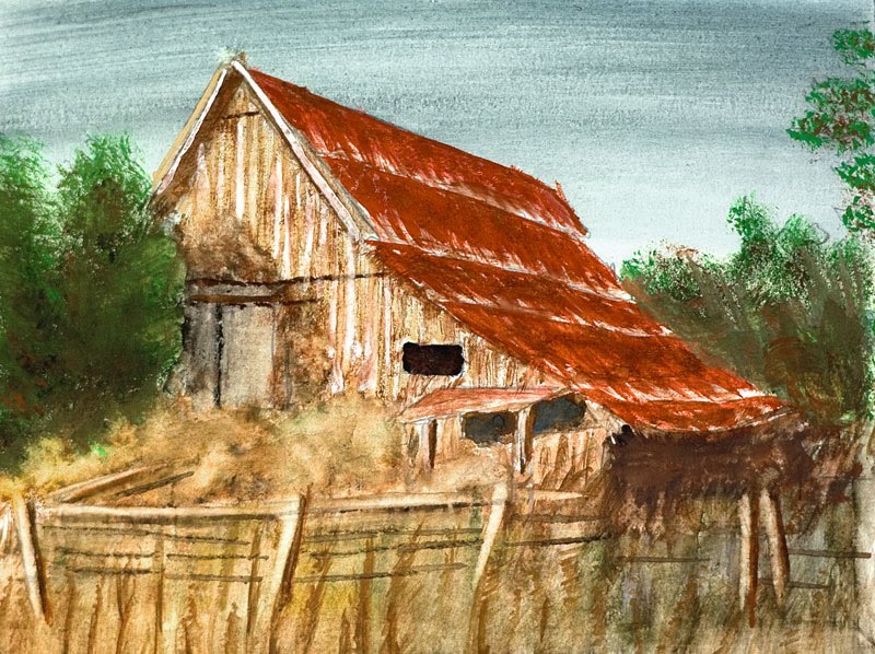

Gouache Montage
I am pretty happy with how this turned out, I just wished that it had printed better. I like the mix of different textures that I was able to capture both in the background and foreground elements. Not sure what I am going to do different for the redo.


Realistic & Sexy Product Illustration
I thinks that this illustration captured the sexiness that was needed for the assignment. I wish that I had some more detail brushed for the text, but I am very happy with how the green liquid and glass looks.


Line + Watercolor
I like this piece because it is so simple and effective. This makes me realize that I am spending too much time on other pieces just messing things up overworking it and not distilling them down to the needed elements.


Gouache Pickout
I really like the style of this piece. I think that the feeling of motion comes across very well with the line style. I think that the street sign is the biggest problem in this piece currently.


Here are the five pieces that I have selected for my midterm portfolio. I tried to select a wide range of the things that I have done. The collection represents a good sample of what I have accomplished thus far. Good times.

Friday, October 9, 2009

Gouache Montage - Sketch/Comp Stage


I decided to go the route of least coherence in regards to the three objects I chose. I think that the three shapes go together pretty well in the visual space, especially with the current organization. I had no problem with the sketching stage but I did run into problems when moving to color. I have discovered that it is a very different thought process working with markers than most other media. Having to work up to comp using lighter colors first and them moving darker was quite a challenge, especially with the mess the other students have left the markers in. I think that I am starting to understand it better now though. Now I just have to gouache it up.

Monday, October 5, 2009

Cartoon Final Phases


I think that this cartoon turned out pretty well . I had some problems initially getting a gag that would read well, but I think that it is pretty clear now. It is hard shifting gears from a realistic depiction of objects with water color and gouache to the more simplistic cartoon style. I will definitely have to experiment with different cartoon styles in the future since there are so many different things to play with stylistically. Good times.

Thursday, October 1, 2009

Cartoon - sketching phase


These are the rough sketches that were picked and then built upon. I was not sure about how well I liked everything until the latest sketches where the idea is really starting to shape up nicely. I think that changing the angle and tweaking a few other things has helped to create a much more successful over all scene/comp. I need to work on some of the finer points before inking the whole thing up, but thus far I think it is progressing nicely.

Memory Portrait


This project was definitely a big challenge for me. I very much like having a reference point to work from, and for this I had a big scary blank canvas.
I have a better idea of what to do in the future as far the the process goes. I think that I was not using my earlier process as a building block, but starting over each time. I redid the last part of the piece and am happy that I did, although I still think that I could do much better in the future. Not a great final product but a helpful learning process non the less.

Friday, September 25, 2009

Missed Illustrations


I think that I forgot to blog about some of the pieces that I did a while ago. Here they are for reference.

Tuesday, September 22, 2009

Realistic Soda Bottle


Well it looks like I should be payed about $110 per hour for this piece, and that is while doing it with near constant sneezing and coughing. I painted this Jones green apple soda using my new set of higher quality Maimeri gouaches. They so much nicer to work with, nice pure bright colors all around. I think that I was able to capture the way that light traveled through the clear parts of the bottle. I had some difficulty trying to paint the extra small type since I only have larger brushes. I think that there is at least a little bit of "sexiness" to this so I am pretty happy.

Monday, September 21, 2009

Gouache Pick Out

Well I just figured out why so many of my images shot in RAW look so bad on the web, annoying sRGB and Adobe RGB color profiles. This illustration turned out much better than I expected when I began working on it. The pick-out method was a little unyielding at first, but I eventually got the hang of it. I like the way that the piece conveys a sense of motion and excitement. I am anxious to do more with gouache in the future.

Tuesday, September 15, 2009

huge 20*30


I quite enjoyed working on this piece, I think that the secret to getting in the right groove is to have some good beer and good music. This scene was quite a challenge to do, but I feel like it helped me develop more because of it. I used T Madden's 5 analogous + 1 complementary color technique and it seemed to work out pretty well. I think that the illustration captures the feel of Sweden's West coastline. I just wished that I hadn't muddied up some of the lower parts of the illustration.

5 line-watercolor + 5 watercolor-line


These two illustrations are probably my most successful from my last batch of images. They were both done with line first and followed by watercolor. I tried to be as accurate as possible in the landscape, while with the coffee cup I tried to be more free and expressive. I think that the coffee cup is the strongest piece overall, although I really like the way that the distant rocks turned out in the other illustration.

Friday, September 4, 2009

10 Landscapes


Well I am feeling a little more confident with watercolors after some tips during Mondays class. I think that this painting is probably my best of the 10 example. I think that the colors and the textures mixed together pretty well to create an interesting composition. I think that the only real problem with the piece was with some of the vegetation not looking the way that I had hoped and general over working of some elements.